Using Variation to Understand Improvement and Inform Action
 Using data to understand system-level change is critical for quality improvement (QI) projects. Data, viewed in a sequence, like time or a series of events, helps us understand if changes we make to a system or process bring about improvement. Yet, it’s easy to under or over react to one data point change on a chart without best understanding how to interpret variation.
Shewhart control charts are an effective tool to understand variation, make judgments about a system’s stability and see graphically whether improvement occurs. Looking at data this way prevents us from seeing trends where they do not yet exist, or overreacting to any single data point.
A control chart accurately identifies variation within any given system or process. All systems will have expected variation within certain limits. Control charts help identify whether that variation moves beyond what is expected. As NICHQ Associate Director of Improvement Patricia Finnerty, MSc explains, “Anybody involved in a quality improvement effort is going to benefit from using control charts because they help us better understand data over time.”
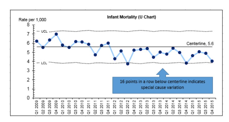
As shown in the chart below, control charts are made up of three lines: a centerline that is the average of the individual data points, and one line above and one below that provide the control limits. A stable system, is a system that has only common causes (also known as expected variation) affecting the outcomes. In contrast, an unstable system is a system with outcomes affected by both common and special causes.
 Take the control chart to the right: it displays one state’s quarterly infant mortality rate over a six-year period. As the call-out notes, the chart shows special cause variation, which identifies the system as unstable. Unstable systems aren’t bad. The lack of stability may be caused by the changes the state is proactively making to reduce their infant mortality rate, or by other environmental contextual changes that act on the system. Investigating special cause variation means considering which changes in the state’s health, public health or social service system may be leading to the signal of special cause variation.
There are five rules for detecting special cause variation. To find out more about them, click here.
“In interpreting control charts, it is important to ask which changes were introduced that might relate to the special cause variation detected,” says Finnerty. “Changes associated with positive system changes can then be mined for key takeaways, so they can be sustained and spread. In comparison, changes that do not result in positive system change can be mitigated, adapted or abandoned.”
Equally important is how to react to a stable system where variation is predictable. Control charts are critical when analyzing a stable system because they keep participants from overreacting to natural variation, which could result in increased variation and wasted resources. However, identifying a system as stable can result in a problematic misperception: the propensity to misunderstand a stable system as a good system.
“Most systems have room for improvement,” explains Finnerty. “Once we identify a system as stable we know that we have to redesign that system to drive improvement.”
Often this means reducing variation and improving the system’s capability. Redesigning a new system involves setting a common vision of the system’s potential, identifying the major drivers of change, and then beginning to introduce those changes into the system by use of Plan-Do-Study-Act (PDSA) cycles of learning. Continuing to monitor control charts reveals whether the changes introduced lead to signals of special cause variation in the direction of improvement.
“Keep change efforts moving forward by updating charts consistently and examining data in real time,” advises Finnerty. “Control charts also shouldn’t be examined in a vacuum; you need to know what is happening on the ground—what changes have been implemented within the system—to most appropriately react to changes you see in the data. Annotating control charts with program efforts and regular meetings with data analysts and program staff can help to remove silos and enable more accurate analysis.”
By circumventing flawed reactions to variation in data, control charts help participants make the most of all resources, an essential benefit for systems change. By adapting a statistical process control approach, state and local health departments can better monitor, detect and learn from changes, which will help them identify areas for improvement and better plan and invest in future changes.
Keep reading to find out more about how Vermont is using data to drive their decisions and create change.
